GeoSoftware UI Icons
GeoSoftware Application Icons
visual design design systems brand development design research iconography
Desktop Application
GeoSoftware is a division of CGG, providing the industry’s preferred set of tools and support for multi-disciplinary teamwork and integrated workflows. GeoSoftware was looking to create a set of new icons for it’s version 11.0 application. The client had a 3 month timeline to complete it’s development of the application and implement these icons.
My Role
I was the lead and only designer for GeoSoftware’s icon suite creation. During this project I worked very closely with the Senior Software Developer for testing and implementation purposes.
The Process
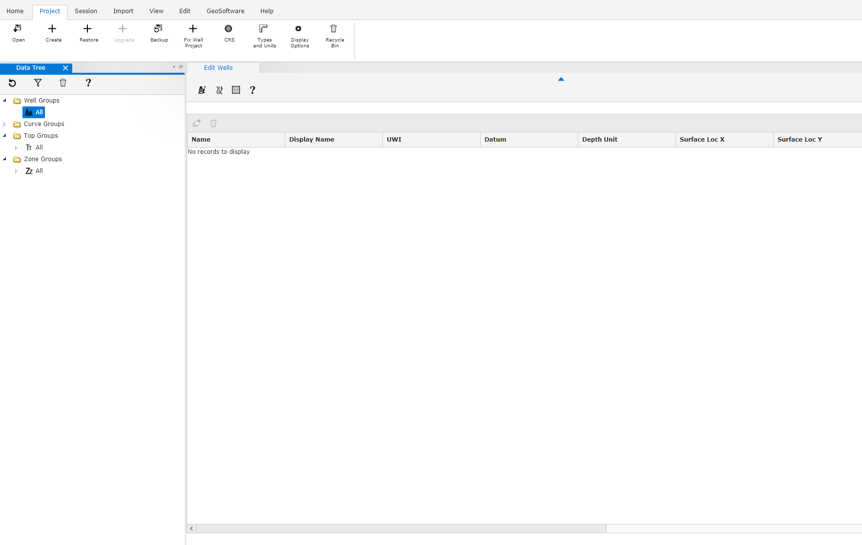
When approaching the design challenge of creating 76 icons, I first had to understand the placement and use of these icons in their native application environment. It was important that I saw the existing icons in the prototype of the software so I could see the multi-states, size, and scaling.
Once I had a strong understanding of the application I began my research starting with various design applications and reviewing oil and gas applications. With this in mind, I reviewed the brand to begin mentally pulling any design elements or assets to create the icon suite for the application and for the tools within the application. I started with an initial set of 10 simple icons based on the request document (first image) to establish a baseline. This process proved incredibly effective as it allowed me to rapidly build out the remaining 66 icons within the week.
Next, I worked with the Brand Manager to establish a new color palette for the application icons and began working towards a new graphic style reminiscent of Adobe CC icons. After several variations of color, gradient, angle, highlight and saturation were tested, I was able to bring all of those elements together and generate the new application icons.


